Human cities for human people
In my previous post (“How did we get used to out-of-scale cities?”) I outlined how we can boil down urban spaces into four primary categories: private-resting, private-moving, public-resting, and public moving. In a city of people, all four spaces should use the human as the basic design metric for scale.
We all know this scale, mostly by how we notice it when a space deviates from it, like in a cathedral or jail cell. However, the modern world has largely abandoned the human scale in public movement spaces.
Most of us don’t notice because we experience those spaces at high speeds, enclosed in a vehicle (which is essentially a private resting space minutely designed to human scale). People who get around by walking, bicycling, or riding can’t help but notice it, and they are often the ones advocating for bringing human-centric design back to the realm of transportation.
Figure 1a. Private and public places for rest and movement—designed for humans.
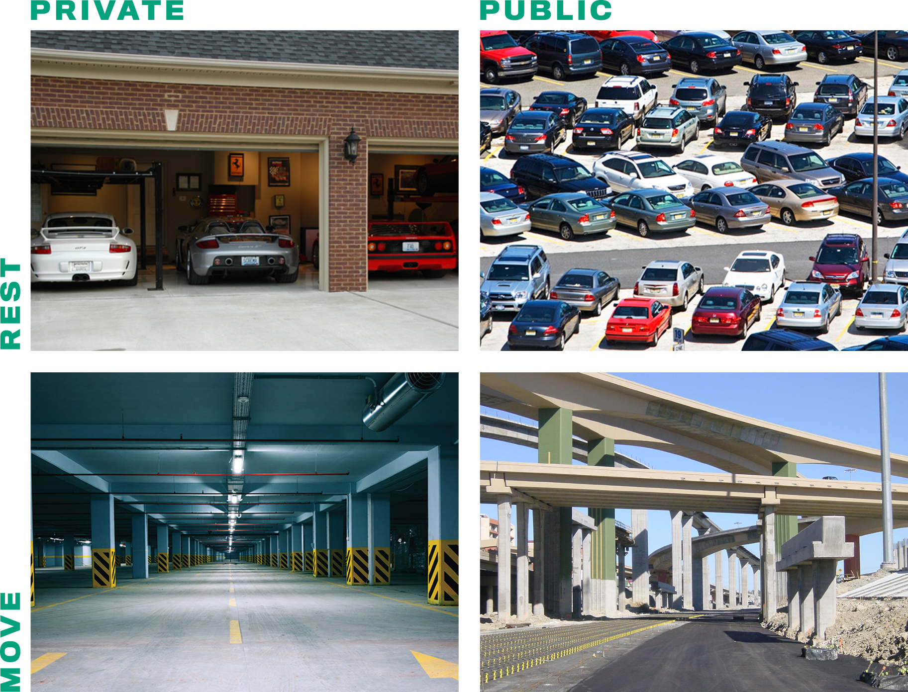
Figure 1b. Private and public places for rest and movement—designed for cars.
In Figures 1a and 1b above, you’ll see the four types of urban environments. The first set of images (1a) are scaled for human, while the second (1b) are built to prioritize vehicle movement or storage.
Many of us become so accustomed to shifting from one scale to the other we often don’t notice the magnitude of the issue. Or we notice the shift but presume, because it’s what we’ve seen all our lives, that it’s normal and possibly even necessary.
When we think about our cities, we tend to think of streets as being the places we build for vehicles and blocks as being the places we build for people. Let’s take the example of a particular corner of Fort Worth that is generally thought of as “urban,” or at least more “walkable” than normal.
Figure 2. A simple breakdown of lots (or blocks) and roads.
Taking a blocks-vs-streets perspective, Figure 2 shows much more what looks like a pretty high ratio of people space (gray) to vehicle space (white). Not so bad right?
Well, let’s get more detailed. Figures 3 and 4 look at the same location, but in these images we’re classifying spaces into one of the eight urban environment scale types outlined above in figure one. When we go into greater detail the design scale becomes much more apparent.
Figure 3. Places where people and vehicles move and rest.
Figure 4. Places where people and vehicles move and rest, with satellite image.
This type of development is typically known as a super-block because of the long distances between public right-of-way intersections (the streets bordering the block). However, when we include private streets, such as parking lot drive aisles, then the block structure becomes much more fragmented and vehicle-oriented.
The space where vehicles come to rest (red) has a much larger footprint than the space where people come to rest (turquoise). Likewise, the space where vehicles move (grey) has a much larger footprint than the space where people move (bright green).
Overall, we end up with much less space designed to a human scale than we may have originally thought.
What we humans keep saying we want
I think one of the strangest facets of how we’ve built our urban spaces is that we don’t communicate desire or value for this scale of design in any other medium other than our built environment. Left alone, humans don’t naturally design or prefer vehicle-scaled environments.
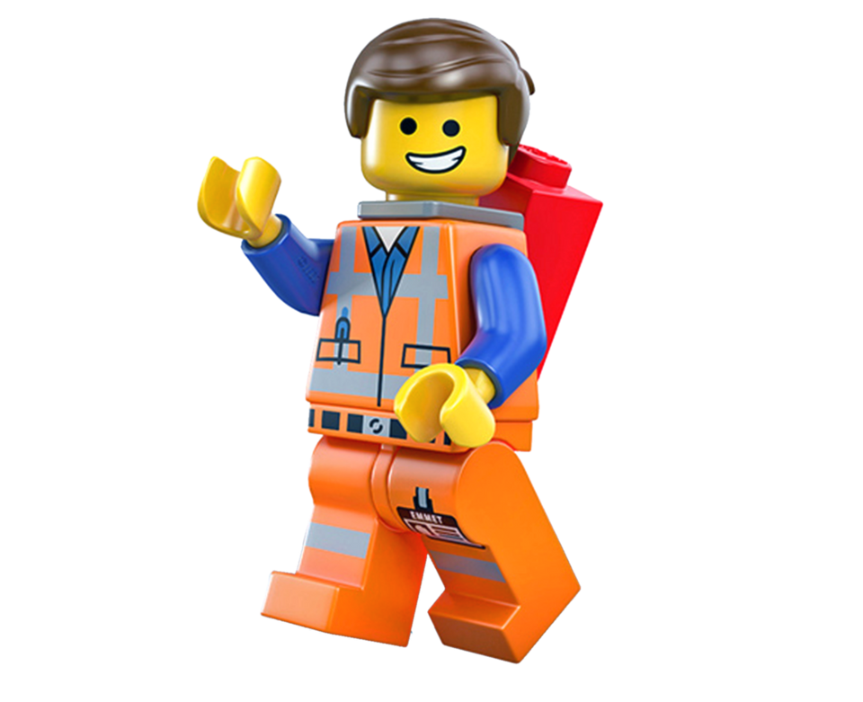
It’s not uncommon for planners to go into schools and ask children to design their ideal city using boxes or other craft materials. The results almost always look like gridded urban cities (below). They rarely include parking lots or 16-lane highways. Even when children (or adults) design LEGO cities, they’re always build to the LEGO man scale, and look nothing like many of the auto-oriented cities we actually live in. I can’t find any LEGO super store sets that include a large one-story building with an even bigger surface parking lot. LEGO designs all their sets at the LEGO man scale. Because what other scale would they use…right?
With three young children of my own, I’ve read an enormous amount of children’s books, and I’ve noticed that most of them take place in one of two settings: farm or city. Kids movies are the same way. Amazingly, even Pixar’s “Cars” movie series manages to avoid settings like large surface parking lots or ten-lane arterial roads. In fact, many movies over my lifetime use car-dependent suburban settings—most commonly in thriller and horror movies—where suburbia communicates things like monotony, hidden evils, isolation, boredom, and oppression.
I’m not claiming, of course, that every on-screen display of post-WWII suburbs is an intentional statement on their moral value. I am saying, however, that filmmakers have to consider scale in just about every scene. And when they intentionally place a person in a built environment with a nonhuman scale, they’re not necessarily communicating comfort.
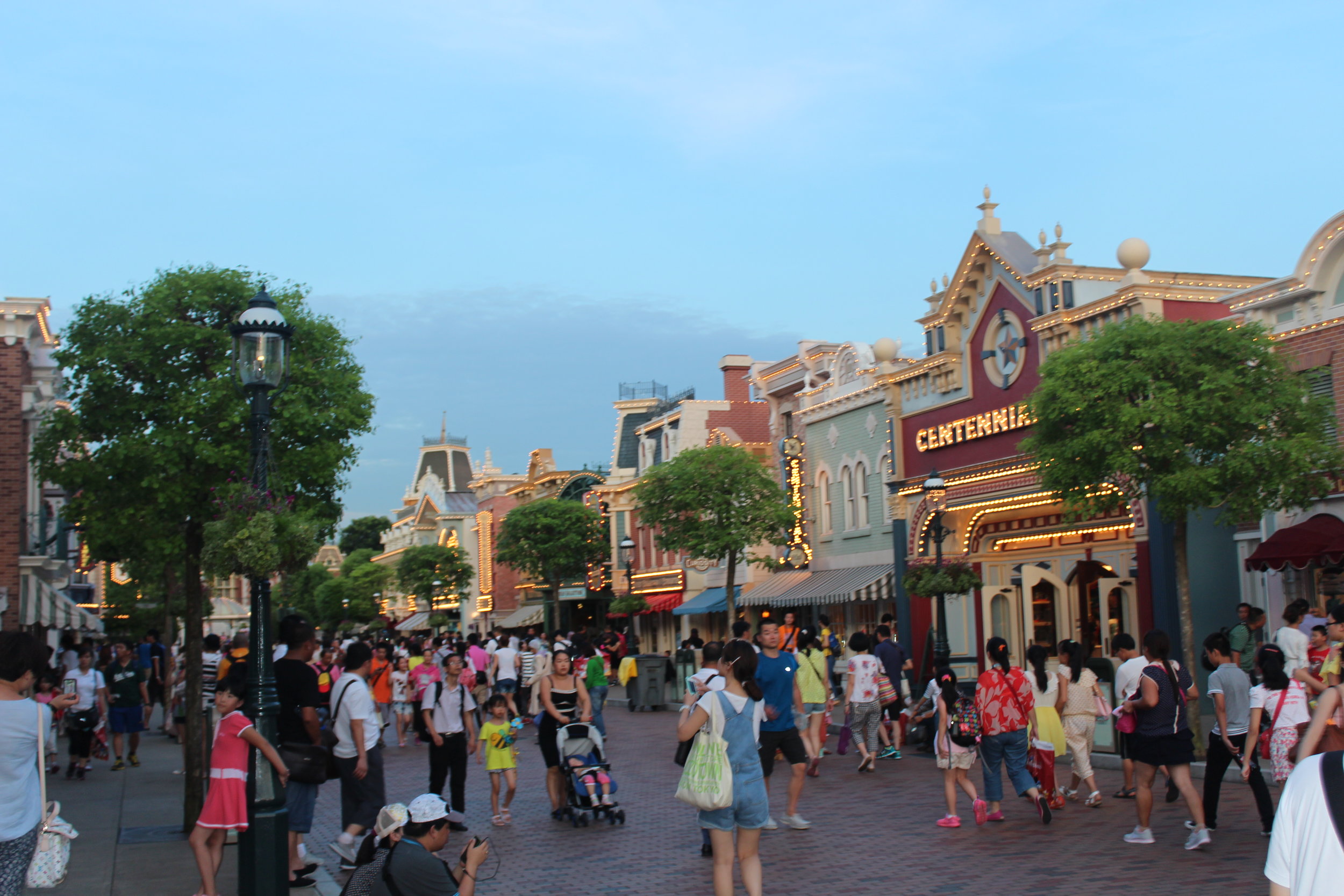
Speaking of finely-tuned environments, look at one of America’s most famous streets—Main Street USA in Disneyland. The place was meticulously engineered to make humans feel comfortable and happy. In fact, not only is Main Street USA not designed for cars—it is explicitly exaggerated to a scale even smaller than humans are accustomed to. Part of the coziness of Main Street USA owes itself to the use of a trick called “forced perspective.” The first floor of any building is to (human) scale, but the (façades of the) second and third floors are set to 5/8 and 1/2-scale, respectively. Obviously, the upstairs of these buildings aren’t intended to be used, but the overall design of the buildings and the street they frame reflects (and underscores) the insight that we humans prefer environments that make us feel like we belong.
Main Street USA.
So what’s up with the real world?
Commonly though, when cities try to guide development more towards the human scale they often meet opposition in some form of the argument that, “well, we’re only building what the market demands, and that’s vehicles.” The problem is our built environment has not come from a demand driven market.
Our most desirable cities in the highest demand correlate well with walkability, transit, and a human-scale environment. Those same cities often have the biggest affordability issues because they’re in such high demand and low supply.
Our current built environment comes from a supply-driven market. Those who protest building to a human scale are often suppliers themselves, who already have the market cornered.
So, what’s my point? Who or what is the market demand for vehicle-scale development? If we have a market of people, why doesn’t it demand development for people? If it’s a supply-driven market, we should demand a human-scale supply.
We (as humans) know that humans prefer environments built to our specific scale. Our own dreams and nostalgia indicate that we don’t really want vehicle-scale cities. We don’t like them. We exclude them from the imaginary ideal worlds we create for ourselves and our children. Our fantasy worlds, paradises, vacation destinations, Shangri las, El Dorados, and heavenly realms never seem to include big box stores, giant surface parking lots, and 16-lane highways.
They may have streets of gold, but they’re human-friendly streets, safe to walk down, and full of people.


