How did we get used to out-of-scale cities?
People tend to have a narrow scale of spatial comfort. We regularly adjust our surroundings to arrive at a setting we feel comfortable in. We make small rooms feel larger with windows, mirrors, and by keeping them uncluttered. We make large rooms more inviting by arranging furniture to create multiple small rooms. Think hotel lobbies, or the way restaurants arrange tables. We build to human scale for comfort. The human scale also has important economic impacts that we’ll touch on in a bit.
When good architects design buildings, they use people as the foundational size metric. The size of most office buildings has a strong correlation with how many people the architect designs the building to accommodate. The same principle applies to homes, stores, schools, restaurants, and other structures. Admittedly, this varies a bit depending on wealth, but for the most part we see this pattern everywhere. It’s a pattern we expect to find in the places we inhabit.
Places for rest vs. places for movement
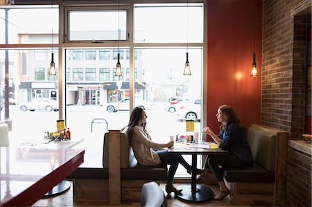
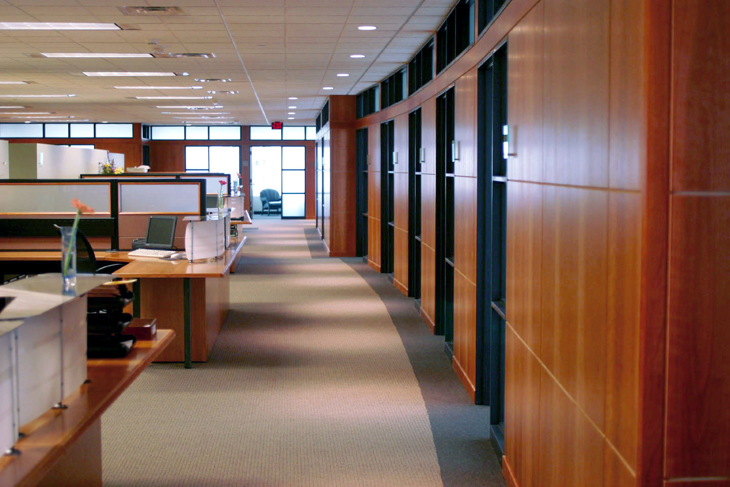
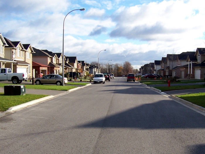
Any built environment, including cities, consists of two primary spaces: Spaces where people or things come to rest, and spaces where people move. These first three pictures illustrate spaces where people come to rest, and they’re built to a comfortable human scale. The next three pictures illustrate spaces built for people and things to move through. The aesthetics may change, but when we break down into the math we find narrow ranges of consistent patterns.
People typically have a keen ability to notice interruptions in patterns without really noticing the pattern. It’s what makes us do the double-take when we notice something unusual, like a dog sitting in the driver seat of car. It’s what slows us down when we walk into a large majestic space like a cathedral. It’s also why we tend to hurry through tight spaces. We don’t take much notice of the spaces we spend lots of time in—offices, hallways, bathrooms, or bedrooms—because they mostly follow these rules of scale.
Public spaces
Have you noticed a secondary pattern in the first six pictures (above)? They’re all private interior spaces. What about the exterior public world? Architects and landscape architects follow similar rules of scale for public exterior spaces.
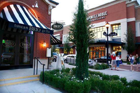
The three pictures below show public spaces that operate on a discernible human scale.
These spaces differ in size based on how many people they’re meant to accommodate, but they’re all built to a human scale. They’re also all spaces designed mostly for people to come to rest, not for moving people. So far everything looks pretty good, but we’ve left out a crucial component of our built environment; public spaces for people to move. Double take…
We’ve designed our public spaces for movement at a scale much bigger and faster than a human scale. It’s dangerous and often unsightly—but we’ll leave goodness and beauty for a later time. The truth of it is sad. Scenes like this don’t illicit much of a double take, but why? Why aren’t we shocked at such a hideous departure from the human scale? On the one hand, we’ve grown accustomed to them. On the other hand, we don’t really see them that much. People who walk, bike, or use public transit see them, but they’re a tiny segment of the population. We mostly experience them via a well-designed human scaled private space:
We’ve effectively isolated our human-scale environments within a network of vast auto scaled landscapes. If you’re wealthy enough, you can shield yourself and your family from it entirely within the cozy confines of a luxury waiting room on wheels. You can also avoid those ugly congested freeways by taking the toll roads in some places (though even those tend to get crowded as well). However, if you can’t afford a car, or you prefer not to spend years of your life in traffic, or you just crave the outdoors and actually seeing other humans, then you’re stuck with bad and/or dangerous alternatives.
“Walkable” developments built for cars
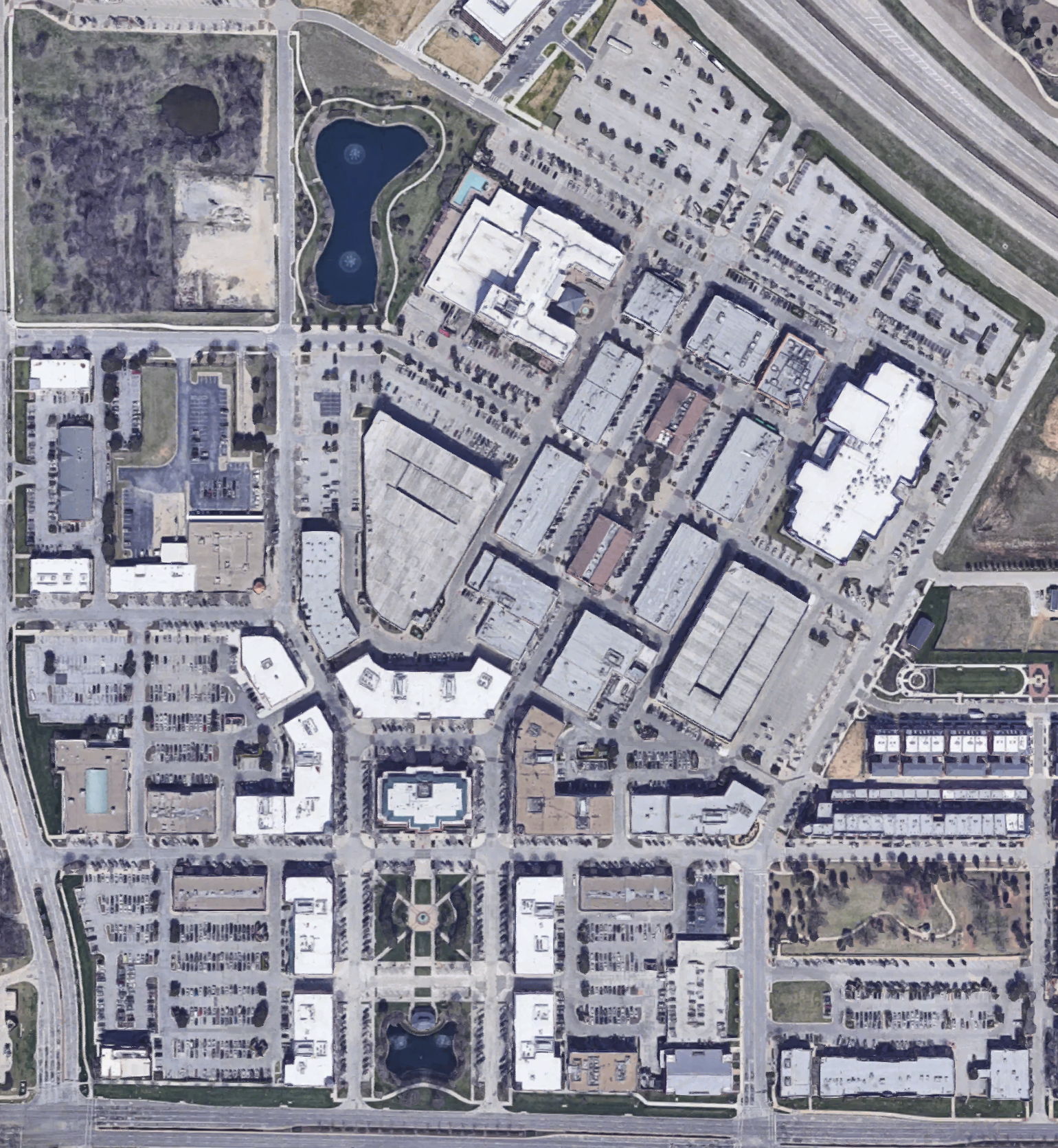
Most of us stay so detached from these spaces inside our cars that we don’t realize the degree to which this type of environment dominates our cities. These next two pictures come from newer “mixed-use” developments in Southlake (left) and Fort Worth (right), Texas. Notice the differences between the street views of these developments vs. the birds-eye view. The birds-eye view reveals that designers still programed most of the built environment for cars instead of people. Like a crafty addict, we managed to sneak the auto-centric scale into our new “mixed-use urban developments” even when we said we didn’t want to. The glitzy street views avoid showing the surface parking lots and wrapped parking garages further concealing the issue.
From above, we can see the large amounts of space dedicated to parking (where cars come to rest), exposing a primary design scale other than human. The streets (space designed for movement) surrounding these developments also have an auto-centric design scale. Lastly, while we don’t identify them as streets, the parking aisles effectively serving as local interior streets have even less human scaled design than the main thoroughfares.
Our current city building practices have a chronic design scale flaw, and it’s no harmless flaw. It poses serious equity issues, heavily burdening folks who can’t afford a car. Neighborhoods built to human scale keep destinations close enough to walk most places. The human scale also makes public transit a viable option. Auto-centric scale, on the other hand, spaces everything out so much that owning a personal vehicle becomes a requirement to participate in society at all. That makes the cost of owning and operating a vehicle look very much like a tax. It’s a heavy tax that many people, especially families and the poor, struggle to keep up with. It’s a tax that, in very real ways, stunts personal wealth building. In many cases the full cost of owning and operating the required vehicles exceeds the taxes people pay on their homes. That’s on top of the traditional taxes we already pay which go toward furthering our auto-centric transportation infrastructure.
It also creates an economic burden that cities have become far more aware of recently, as they see a rising demand for maintenance and a shrinking revenue pool. Road infrastructure maintenance remains an enormous cost burden on local, state, and federal agencies. Many of those agencies report a maintenance and service need that far exceeds their ability to fund. The larger than life maintenance costs reflect the larger than life infrastructure system we’ve built.
To begin addressing a chronic design flaw we first need to notice it—how it diverges from the natural patterns of an environment built for humans. It’s often helpful to take a step back and look at context, like we’ve done here. When we do, we find human-scale islands scattered across an auto-scaled network of public spaces meant for movement. At Verdunity, we aim to help people and city leaders discern both the beneficial and detrimental patterns in their own built environments. Then we hope to inspire those same people to build new and preserve existing human scaled environments, and to restore any existing environments built at an inhuman scale.


